The Impact of COVID-19 on Sustainability

I haven’t posted in a while with school and the pandemic, so I decided to go ahead and put up some of the more interesting projects I’ve been doing for school. This is a paper that was suppsosed to be 6 pages or so, double-spaced. Clearly, I went way beyond that. I’ve lightly edited the text.

Introduction

My goal is to explore how COVID-19 has impacted the march toward sustainability. This paper has three sections: the first attempts to overview the “pre-COVID” state of sustainability, especially with respect to the power and transportation sectors. The second discusses the short-term impacts that we’ve already experienced, and the third discusses potential future impacts and the possibility of “green stimulus” (stimulus with a focus on sustainability). Due to the length of this paper, it’s impossible to accurately cover everything in full detail – hence the decision to focus on the power and transportation sectors in particular. It’d be impossible to put everything together in one (small) document, but hopefully this paper can do a decent job of putting together enough puzzle pieces to get a sense of what the overall picture is supposed to look like.

1 | Where were we?

Here’s a breakdown of emissions by source for the world as a whole in 2016 and the US in 2018:

The Sankey chart [1] showing global emissions comes from the World Resources Institute, a pro-climate think tank over in Washington, while the pie chart comes from the US EPA. Note that the US (which is a much more advanced economy than the global aggregate) has a larger share of emissions coming from transportation than the rest of the world.

Pre-COVID, the most important global trend was the link between GDP growth and energy demand growth: to grow the economy, you had to have more energy to do so – energy that usually came from fossil fuels. However, that inexorable trend had finally started to break down. A 2019 article from McKinsey points to 4 key factors: (1) a decrease in GDP energy intensity, i.e. the amount of energy necessary per unit of economic activity, driven by a shift to more service-based economies, (2) an increase in energy efficiency, (3) the rise of electrification, and (4) trends toward renewables as an electricity source.

For brevity, I’ve chosen to leave out discussion on the trend to service economies (though McKinsey notes that the important shifts will come from India and China, as wealthier nations have already mostly shifted) and energy efficiency (while a growing global middle-class will buy more appliances and HVAC systems, the increase in demand will be offset by increased efficiencies in those machines). Overall, the important points are that McKinsey forecasted that “the energy needs per capita at a global level will be 10 percent less in 2050 than they were in 2016, despite the rapid rise in demand from the many households entering the middle class in emerging economies”.

Electrification in the Transport sector

The rise of electrification is pervasive across industries, but nowhere will it be more profound than in the transportation sector – especially due to its large share of the emissions mix in the highly developed countries and regions where EVs will first take hold (China, Europe, and the US). Automakers have an onslaught on new models slated to hit global markets, as this chart from McKinsey shows:

All of this will reinforce existing growth trends in the market: global EV sales have been steadily growing over the past few years at well over 50% per year, and global market penetration rates have climbed accordingly, as shown in the figure below from McKinsey:

While increased public desire to live a more sustainable lifestyle is likely a contributing factor to the growth of EVs [2], decreasing manufacturing costs (especially from the battery, which accounts for a significant part of the EV powertrain cost) are likely the main driver. However, the price differential in cost of ownership between EVs and traditionally-powered vehicles is also likely to be a contributory factor; it's possible that the fall in gas prices may effect sales moving forward (at least in the short-term).

A Shift to Renewable Electricity

Complementary to the shift toward EVs is a shift toward renewable power generation, which accounts for 30% of global emissions and 27% of US emissions (as shown in the charts above). Especially since electrification will occur in places other than just the transportation sector, electricity demand both in the US and globally is forecasted to grow. The chart below from the EIA’s 2020 Annual Energy Outlook plots out forecasted electricity generation through 2050, and the IEA also anticipates global growth in electricity generation:

Long-term projections from the EIA. Click to expand.

Long-term projections from the IEA. Click to expand.

Rising electricity demand is only one part of the story. As the graphs above indicate, the second (crucial) part is a shift in the electricity mix, the sources from which we generate electricity. Renewables (especially wind and solar) are set to grow exponentially over time, as coal demand (especially in developed economies) wanes. This is predominantly driven by pure economics: renewable options such as wind and solar will become the cheapest source of electrons nearly everywhere in the world within a few years:

Indeed, in countries such as the US, the electricity mix has already begun to clean itself up: the chart below (from 2017) shows what the emissions from the power sector would have looked like had the status quo from 2005 kept its course.

This chart actually highlights the trends we’ve seen over the past few years: lower demand growth from increasing efficiency (and a more service-based economy than we’ve seen in years prior), a change in the energy mix (natural gas has exploded, coal has declined), and a shift in favor of renewables.

To be clear, there are also other trends in the sustainability movement, e.g. the rise of ESG investing; investment into renewables in general; and the development of fake meat (see: Beyond Meat, Impossible Foods). Nevertheless, most trends in the world were positive ones (whether these changes would have been “enough” to hit some arbitrary threshold is a point I choose to leave out for brevity).

2 | What’s Happened so far?

Having discussed pre-COVID trends in sustainability, we now turn to some of the effects that the pandemic has had on the environment. Of course, these are inextricably linked to the state of the economy – as economic activity increases/decreases, so too do emissions outputs. As of May 8, unemployment in the US reached 14.7%, worse than any point since the Great Depression. China’s GDP contracted 6.8% (Q1 2020 vs. Q1 2019) and the US’s GDP fell 4.8% (again, Q1 ’20 vs. Q1 ‘19). Thus, we might expect to see some beneficial effects – and while they are there, there have also been some negative ones. The main theme: COVID-19 has been mostly good, though not perfect for the environment as a whole.

Starting off with some good news: in the electricity sector, demand for coal (the dirtiest of fossil fuels) is expected by drop 8% globally in 2020 versus the previous year [3], according to forecasts from the IEA. This number is more severe in developed nations, where coal was already on the decline: the IEA expects a 20% drop in coal demand in Europe and a 25% drop in the US. Meanwhile, renewable energy generation continues to grow, since these sources operate with near-zero marginal cost. Several regions across the world have experienced year-over-year declines in power demand [4]:

Above ground, the decline in air travel has already reduced CO2 emissions by 10 million metric tons – according to older data from mid-March. The total decline is likely much higher and growing by the day. On the roads, COVID has reduced congestion: data from TomTom indicates a near 60% drop in traffic congestion in Mumbai, and a near 30% drop in London. In the US, StreetLight Data created a map of the decrease in daily vehicle miles traveled:

Adding these effects from reduced economic activity together, the IEA forecasts that emissions in 2020 will be 2.6 billion metric tons of CO2 lower than in 2019 – about an 8% year-over-year drop. In usually polluted cities, there’s also been a drop in particulate matter: Los Angeles, Delhi, and Mumbai are all experiencing a roughly 50% drop in PM2.5 compared to pre-COVID.

That’s all good news (even if it stems from an unfortunate cause). However, not everything is sunshine and roses: single-use plastics and paper products are on the rise in an attempt to reduce disease spread, and cratering oil prices (itself the result of lower demand from COVID) have resulted in the price spread between recycled and virgin plastics widening (which will in turns shrink demand for recycled plastics among firms that haven’t truly committed to sustainable processes). Indeed, the fall in gas prices may have contributed to an undesired shift in which vehicles are selling: in the US, pickups are now outselling passenger sedans [5].

3 | Future impacts, moving forward, and “Green stimulus”

Any discussion of the long-term effects of COVID-19 is likely to be reasonably-informed speculation at best, so I primarily rely on the opinions of experts in this section.

As far as electricity demand goes, the US EIA publishes their forecasts in the Short-Term Energy Outlook (previous released on April 7th, though the next update is tomorrow on May 12th). Highlights include (1) a general decrease in electricity production over 2020 and 2021; (2) coal being particularly hard hit in 2020, while renewables continue to grow healthily; and (3) an expectation of delays in bringing new capacity (predominantly renewables) onto the grid. I was unable to find any high-quality recent forecasts from reputable sources for the global community, though I’d wager that other developed regions (such as Europe) will likely experience similar trends.

While lockdowns may subside in the coming months, it’s unlikely that end-consumers will rapidly revert to pre-COVID behaviors. While this may spell trouble for restaurants, bars, and theaters, it’s worth contemplating whether in-person meetings will fully recover (and since business customers are often the most profitable consumer segment for airlines, they’re in trouble, too, though the impacts on emissions are less clear: fuel prices are a huge cost driver for airlines. In any scenario, air travel only accounts for about 2% of emissions). Additionally, health concerns (along with cheaper gas, at least for now) have driven heavier hits in public transit ridership than private car driving: Apple reports that in Berlin, driving is only 28% below normal, while transit use is down 61%. Similar patterns have emerged in Ottawa, Madrid, and other large cities, as shown in the chart below:

As job losses mount and consumer preferences shift, the question for governments and agencies around the world becomes one of recovery: what are the next steps to take? What values and priorities are top of mind? Which policies are most beneficial? An Oxford Smith school survey I came across from May 4th surveyed “231 central bank officials, finance ministry officials, and other economic experts from G20 countries on the relative performance of 25 major fiscal recovery archetypes across four dimensions: speed of implementation, economic multiplier, climate impact potential, and overall desirability.” Highlights include (1) a consensus that unconditional airline bailouts would be not only a poor use of stimulus funds, but also be likely to have a negative environmental impact; (2) consensus that clean energy infrastructure investment and clean R&D spending would be highly positive for the environment, though slow to kick in and not particularly stellar at stimulating the economy [6]; and (3) consensus that some rescue-type policies such as liquidity support for households and small businesses, temporary wage increases direct cash transfers, and direct provision of basic needs (funds to help produce and distribute necessities such as food and medicine) would be fast-acting, highly economically-effective strategies (if not necessarily the best for the environment). The results from the survey are summarized in the chart below:

It’s impossible to know just yet if governments will enact these policies, though recent stimulus packages by the US government such as the CARES Act included provisions to assist airlines ($58 billion), individuals (estimated $560 billion), and small businesses ($377 billion).

Conclusion

Before COVID-19 hit, the world was making progress on cleaning up two of the highest-polluting sectors both globally and domestically: power generation and transportation [7]. COVID-19 has greatly slowed down the economy, which in turn has created a temporary reduction in emissions, especially in the power and transportation sectors. As the world recovers from the impact of the virus, however, the environmental impact is less clear: an increase in personal vehicle usage may counteract any drop in emissions; thankfully, short-term forecasts in the US seem to indicate the electricity sector will continue to progress. Green stimulus has been presented as a means of supporting both the economy and the environment, though what actually ends up happening is a great unknown.


[1] One of my absolute favorite data visualization tools.

[2] I didn’t want to waste words on this topic, but some quality reports from the ICCT and the UCS outline the lifecycle emissions differences.

[3] The “magic number” is 7.6% - we’d need global emissions to fall by 7.6% per year over the course of the 2020s to be on a 1.5-degree pathway [Source: page XX of this document]. For better and for worse, the IEA thinks we’ll do it in 2020.

[4] Interestingly enough, I tried analyzing load data from ERCOT, which operates the grid that most of Texas runs on, and didn’t find any drop in electricity demand, at least when I averaged hourly loads across the month. I’m not sure why exactly electricity demand from Texas hasn’t changed that much, since I’m comparing April to April, though at least anecdotally I feel like there’s been more temperate weather than normal.

[5] This may just be a reflection on ongoing trends. Passenger sedan sales were already falling pre-COVID, and it’s possible that the economy is hitting the consumer base for passenger sedans more than pickups – presumably, commercial sales represent some portion of pickup sales, and this segment of demand is potentially less likely to be effected by the state of the economy.

[6] An excellent example of this is the story of how Texas became one of the largest wind electricity generators in the world. This article from Texas Monthly does a masterful job of storytelling.

[7] It’s worth noting that increased efficiency in conventionally-powered vehicles has had a much larger impact on emissions than EVs have. I didn’t really focus on this topic as much since EVs and power generation play hand-in-hand, though I’d certainly be remiss if I didn’t at least mention the improvements in fuel economy across automotive fleets as a whole.

Money(basket)ball

Here’s another group project I did, this time with Kaila Prochaska, Michael Sullivan, Rish Bhatnagar, and Matt Macdonald for our Data Science Principles class. It’s all about predicting the outcomes of regular season NBA games. You can view the presentation that was associated with it here, and associated files (e.g. code, data, etc.) here.

background

Our goal is to predict the winner of an NBA game, and hopefully well enough that we can make money in Vegas. The betting markets for the NBA are vast - for any given game, there are markets on the winner, the point spread, the total number of points, the total number of points in the second half…

While we don’t consider ourselves smarter than the rest of the betting markets, we did hypothesize that it might be possible to obtain an edge - while we doubt the ability to profit off of “smart money” - those making bets using data science techniques, it’s possible that the “dumb money” of fans looking to emotionally and financially invest into a game may be profitable. Fans may be tempted to bet on teams even when the bet isn’t all that attractive; we hoped that we could be beating these market players.

For better or worse, this is a problem that many have tried to solve. We found some excellent blog posts from the usual suspects (such as FiveThirtyEight) and some unexpected sources (even StitchFix’s blog features an article!). As we’ll discuss later, however, even Vegas hasn’t been able to crack the prediction code yet.

the data

We obtained most of our game and player related data from this Kaggle competition. We also obtained betting data (e.g. Vegas moneylines) from this website. Data was also verified using basketball-reference.com (which FiveThirtyEight also uses). The data includes basic information for each game from the 2003-04 season onwards, such as the final score, the home team and away team, the date played, and other basic performance information such as rebounds, assists, and 3 pointer percentage among others - admittedly, we mostly ignored this information, due to concerns of lookahead bias. It also included information on each players’ plus/minus stats, a measure of an individual player’s effectiveness (a good explanation can be found here).

Betting data was available from the 2007-08 season onwards, and for each game we were able to obtain a moneyline for both the home and away teams. From the moneylines, we calculated a “breakeven win percentage” [1] for both the home and away teams: essentially, it answers “Above what win probability does this moneyline bet become profitable?”

We also augmented the dataset with a few additional features. Hypothesizing that back games back-to-back (on consecutive days) may hinder a team’s performance (players might be tired), we added in “B2B_home” and “B2B_visitor” to our dataset. Next, we also decided to add in each team’s the current season’s record (the number of games played, wins, and losses). We added in information on a team’s ELO rating (more on that below) and the predictions outputted by the ELO model, and the average of the home and away teams’ plus/minus when playing at home and on the road.

As previously mentioned, lookahead bias became a large concern as we worked with our data - we didn’t want to use data from the game itself to generate a prediction for that game. Thus, for each game we limited the data available by asking “What information was available at tipoff?” We decided to throw out the data on rebounds and assists and shooting percentages for this reason, and we also had to re-do the season records for each team due to the same issue. We also extended this lookahead bias mitigation to testing our models: we reserved the 2018-19 and 2019-20 seasons for testing, and only trained on information before that. These steps helped ensure the validity of our results.

evaluation

We used two different metrics to evaluate the results of our models. The first, accuracy, is simple: it measures the percentage of games we properly predicted. Each model outputs a “soft prediction” for each game - the probability it assigned to the home team winning. We thresholded these values at 50% (so if the home team had higher than a 50% probability of winning the game, we called it in favor of the home team, otherwise we ruled for the away team). However, while accuracy is simple and easy to understand, it doesn’t account for “market expectations” - essentially, it’s more difficult to call a tossup than it is to call an obvious blowout, yet we value each call equally.

As a result, we decided to incorporate the betting data we had available to create a “profitability” metric that would measure how much money we would be able to make against Vegas [2]. This metric does account for market expectations, though there’s certainly more complexity in our betting strategies: When do we make a bet? And how much do we bet? We decided to create some arbitrary threshold we’ll call “minimum opinion difference”, that basically measures the difference between our soft prediction for each team (the likelihood we assign to a team winning) and the “breakeven win probability” as described above. Whenever that difference is sufficiently large for either team, we’ll make a bet. We arbitrarily chose to use 6% as the threshold - perhaps future work could uncover an optimal setting. On the bet sizing front, we came up with three strategies, described below.

  1. Always Bet $100.

  2. Favor Favorite: When we’re betting on the favored team, bet enough to profit $100 off of the bet. Otherwise, bet $100.

  3. Bet Proportionally: If our opinion difference is X times the min opinion difference parameter, bet $100 times X. As an example, if we predicted the home team to win with 78% accuracy and had a breakeven win probability of 66%, our opinion difference is 12%. That’s twice the threshold, so we’d bet $200.

Ultimately, the Bet Proportionally strategy always returned terrible results, so we didn’t report those results here - it’s apparent that we’d never actually use this strategy. This is likely because when models make truly far-out predictions, the penalties are far higher - we’re betting much more on the predictions that are the furthest away from market consensus.

MonteCarlo results.jpg

Two baselines are relevant for profitability: the first is to ensure our models are actually profitable; otherwise it’d make more sense for us to just never bet in the first place. The second is to see how completely randomly generated predictions fare. We used Monte Carlo simulation (the results of which can be found to the right) to determine the distribution of profitability for randomly predicting games, and averaged a loss of about $2,700. However, there was a significant amount of variance, and in the end we had just over a quarter of trials post a profit.

Models

baseline models

To get a sense of how well our models are performing, we need proper baselines. For profitability, that baseline is simple - doing anything better than nothing ($0 profit) is a reasonable success (with some caveats, though we’ll get to that later). 

On the accuracy front, there were four baseline models against which we compared performance. The first is a simple coin flip - we’d expect to get about 50% accuracy. Next, we observed that the home team wins about 59.3% of the time. We then considered looking at the current season record (after accounting for lookahead bias!), in conjunction with home court advantage for breaking ties. This strategy had an accuracy of 64.2%, and it was against this baseline that we determined progress. Our goal, however, was to reach Vegas’ level of accuracy, and if we were to predict Vegas’ favorite (as determined by the moneylines), breaking ties with home court advantage, we’d get an accuracy level of 68.9%. Our goal, therefore, was to hit 69% accuracy.

K-nearest neighbors

K-nearest neighbors (k-NN) is an algorithm that makes classifications by identifying the K most similar training instances and weighting their classifications. 

Rather than focus on general team statistics and game features (i.e. season records, moneyline, etc.), we focused on individual player statistics. Our idea was to characterize the home and visitor teams by their five starting players: for any given game, we could identify the K games in our training set in which the home teams had similar players matched against a visitor team with similar players. For example, if the Rockets beat the Warriors, and the Celtics had a starting lineup of players similar to the Rockets, then it would be expected that the Celtics would also beat the Warriors.

To begin the process of characterizing the home and visitor teams, player statistics were aggregated and labeled by the player’s name and season. The players were then clustered into five categories based on their stats using K Means clustering. Each of the five starters for the home and visitor teams were labeled by cluster. To avoid lookahead bias, the players were labeled with their category for the most recent past season. For example, when predicting the outcome of a game in the 2017 season, we used a player’s 2016 cluster label. Rookie players or players that we did not have data on were added to a sixth cluster. The model’s final features were the number of starting players on each team belonging to a particular cluster. In other words, if the home team had three cluster-four players and two cluster-two players, we would represent this by setting h4 = 3, h2 = 2, and h0, h1, h4, h5 = 0. This data set was then fed into a k-NN model to find games with similarly matched teams. Unfortunately, the model didn’t perform well: accuracy was a disappointing 52.8%, and the strategy resulted in a loss of $1,962.05 when using the “always bet $100” strategy.

Many factors could have contributed to the poor performance. One problem of note is our inability to assess rookies, which we might get around by categorizing them based on their college performance, salary, or projected abilities. Another extension to the player-focused model is the use of current-season players’ statistics, which would provide us with the most up-to-date evaluation of a player (though this would require game-by-game statistics, rather than season averages). Finally, attempting to match up players on the opposing sides would be an interesting extension. For example, attempting to predict how certain offensive players would fare against a strong defensive player of the opposing team could potentially be insightful in predicting the outcome of a game.

XGBoost

XGBoost is a gradient boosting algorithm that uses decision trees to make predictions (you can learn more about it here, or if you prefer videos, this is part 1 to a quite helpful series). While XGBoost is incredibly powerful, it uses a number of hyperparameters, which we tuned by running a grid search over a wide range of possible values for learning_rate, n_estimators, and max_depth.

We experimented with building several versions of XGBoost models. The “base” set of features we used in all models were (1) the current season records from the home and away teams, (2) the team_id (as dummy variables), and (3) whether the home/away teams had played back-to-back games. We experimented by adding two additional features: (1) the Vegas moneyline and breakeven probabilities and (2) an average plus/minus score for each team - here we used a weighted average of the plus-minus scores for all players on a team for each game, weighted by a player’s minutes played. The actual plus/minus feature averaged this plus-minus score for all games in the previous season, not including the current game.

XGBoost perf.jpg

Results for the different models’ accuracy are shown in the table to the right. In terms of profitability, we made $2,409.48 on the “always bet $100” strategy; by betting aggressively on the favorite, this model profited $3,429.00.

predicting the spread via elo

While other models are looking to provide soft predictions regarding the outcome of each of the games, this model aims to predict the “point spread” of the game (the difference between the scores of the home team and the visitor team). The basis for this model was derived from a paper written by Hans Manner, a German statistician, in 2015. The model aims to predict the game spread by considering 3 factors: a constant home-field advantage, back-to-back games, and a strength approximation of the teams involved in the games. While the paper calculated the strengths of the teams using the Kalman Filter, as well as other forms of dynamic modeling, we chose to use ELO, the current standard for evaluating the strength of a team on any given day.

ELO ratings were originally created by Arden Elo in the early twentieth century in order to approximate the relative strength of chess players. At the time, Elo’s ratings only accounted for wins and losses a player had, rightly assuming that a chess player’s skills remain relatively similar over time. However, as ELO ratings were adapted to other sports (notably NFL football and NBA basketball), the ratings became more complex, with more features being taken into account, all while maintaining the same level of simplicity that Elo imagined when he designed the original rating system. We used the FiveThirtyEight standard for creating ELO ratings, which account for home advantage, margin of victory, and game score.

The spread model generated spreads for 13 NBA Seasons, spanning from the 2007-2008 season through the current (albeit cut short) season. Considering data from over 15,000 NBA games, the model compiled an overall accuracy score of 64.8%. The model also found that the estimated point value for back-to-back games was 3.14 points, identifying back-to-back games as a feature of high importance. The profitability of this model was minimal, yielding a measly $199.78 on the “Always Bet” sizing strategy. 

mlp

Next, we built a simple fully connected multi-layer perceptron (a basic form of neural network), using the features (1) breakeven probabilities, (2) season records for each team, (3) moneylines, (4) whether each team played games back-to-back, (5) plus/minus scores, and (6) the probabilities predicted by ELO.

At first, we ran into problems with the dataset being mildly unbalanced (due to home team advantage), but we undersampled the majority class to solve that problem. We tuned some hyperparameters (e.g. network structure, learning rate, epochs, and batch size) and obtained a test accuracy of 67.68%, just lower than the XGBoost results.

michael1.png

The model was overall very chaotic and prone to overfitting. To deal with this, we introduced a dropout layer with a dropout rate of 0.5 after each dense layer, which explains why training loss was consistently above validation loss. By just training on 10,000 games, the neural network may not have enough data to be as robust as XGBoost. The final network structure is shown below.

This model lost $5,430.99 by betting $100 every time, and lost $11,611.00 by betting aggressively on the winner. This result is wildly different from the XGBoost profitability, which may suggest that a neural network overfits to the training set. This makes it unlikely to accurately predict when the underdog wins, which is where a lot of profit comes from. 

linear regression

While researching projects similar to ours, I found one report that claimed to achieve a 73% accuracy in predicting NBA games during the 1996 season using linear regression. Obviously, their model easily beat the Vegas prediction, so linear regression seemed like a promising model to apply to our project. 

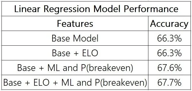
In preprocessing our data set for linear regression, we threw out all games with less than 5 preceding games for each team to minimize outlier values. We also used the 2008-2017 seasons as the training set and the 2018-2019 seasons as the testing dataset. As with the XGBoost model, we created multiple models to experiment with using different features. In the base model, we used (1) current season Win/Loss %, (2) Home Team Win/Loss % at home, (3) Away Team Win/Loss % on the road, (4) Average Point Differential, and (5) whether the home or away teams were playing back to back games. We also tested adding in Breakeven Win Probability and ELO as additional features. The table below shows the results of the different models.

LinearReg perf.jpg

The model that produced the most accurate results included both the breakeven win probabilities and each team’s ELO. While it doesn’t beat the Vegas prediction, this model got extremely close. The most significant features in this model were the team WL% and the breakeven win probabilities by far. Interesting, this model generated $0 in profit, as the predictions made were always too close to the Vegas predictions, and so no bets were ever placed.

results

We also decided to perform one last apples-to-apple test, where we fed the same set of features into each model to gauge the relative performance of each model. We also create a cumulative profit graph for each model, which shows not just how our models do at the end of season, but if we could even afford to make it to end anyways (If we lose $100,000 before we make it all back, perhaps we wouldn’t remain so confident). Results are summarized in the table below, with cumulative profit graphs following.

Models Perf.jpg

You can click on a profitability graph to enlarge the view. In the end, the ultimate question is whether we can consider the outcome a success. Currently, that answer is no - none of our models outperformed Vegas, and even the most profitable of our models has a p-value of 0.192 associated with it against completely random predictions. As a result, it’s hard to conclusively say that our models are working well enough for us to quit our jobs.

discussion and future work

Many options are available toward furthering our work. For one, we could try calculating season averages for features we ignored (e.g. rebounds, assists, shooting percentages), right up to that game in the season. Other features we might want to explore include coaching staff, player injuries, and matching up offensive and defensive players (as discussed in the k-NN section). We could also look into different preprocessing strategies for the data we’re currently using. Moving onto the modeling stage of the process, perhaps we could consider different modeling approaches: for example, Random Forests or Naive Bayes. Additionally, perhaps an ensembling of all of the models we’ve built could be helpful.

We could also expand the scope of our work to predict preseason and playoff games, or to predict different target variables (e.g. the point spread, the total number of points scored in a match, or any other betting markets available). Finally, we could look into alternative betting strategies (e.g. the Kelly criterion).


[1] If the moneyline is negative (usually in the case of a favored team), then the breakeven probability is ML / (100 + ML). If the moneyline is positive (usually for the underdog), then the breakeven probability is 100 / (ML + 100). Usually, adding up the breakeven probabilities for the home and away team was higher than 100%, which reflects one method by which Vegas profits.

[2] We're assuming no transaction fees, which isn't realistic, but since the moneylines are already set such that Vegas has an edge, we're still not playing on even ground.

Some COVID-19 Explanatory Stuff

The fact that this is on my website doesn’t remotely reflect who did the work here - it reflects the fact that I send a $188 check every year over to Squarespace for a domain name and to avoid fighting with CSS. This is a group project I did with Kaila Prochaska and Michael Sullivan for our Data Science Lab class. It’s essentially three mini-projects tied together by themes of COVID-19 and explainability - I’m the primary author for Part 1, Kaila is the primary author for Part 2, and Michael is the primary author for Part 3.


1 | Map-based Animations and Visualizations

While a ton of decent visualizations exist out there (I’m partial to Bloomberg’s), I was never fully satisfied with any one in particular. Perhaps it wasn’t animated or interactive, which limited the user experience, or it didn’t properly account for the full picture - while displaying absolute counts for the number of cases is a natural starting point, I believe that they ought to go hand-in-hand with percentages. The US (at the time of writing) has over 1.3 million reported cases, but also about 320 million citizens. Meanwhile, Spain, with only 47 million citizens, has reported over 220,000 cases. The percentage of the population affected is higher, yet an absolute count would mask that fact.

I thus decided to make my own visualizations, using Excel’s excel-lent 3D Maps feature. I got data from the Johns Hopkins COVID-19 repository on GitHub, which aggregated together an impressive list of governmental sources from France to Taiwan; even more granular data is available for the US. There are some excellent time series available - one, at a global scale, tracks the number of confirmed cases, confirmed deaths, and confirmed recoveries in each country by the day. Another tracks confirmed cases and deaths for each US county by the day. Below are some of the visualizations I built, along with some notes.

First off is a global view of COVID-19. This animation loops three times through the data: the red map shows confirmed cases, the black map shows confirmed deaths, and the green map shows confirmed recoveries. Note how China starts more richly colored on all of the maps - this is because the time period covered by the data starts in late January. This map only shows absolute counts for each of the three metrics, which is why the US and China usually tend to have darker colors.

Next up, we zoom into the United States and view data aggregated by state. Again, we have the same issue: we’re just looking at absolute counts, instead of proportions. As a result, you’ll see New York dominate the map with confirmed cases and confirmed deaths (there was no recovery data for the US). While other states that were also hit hard (e.g. California and Washington) are slightly darker than the rest of the map, it’s harder to tell with New York in the picture.

Now, we move onto relative proportions. Here, we plot what I call the Observed Incidence Rate for each state: the confirmed number of cases divided by the state population. This is an underestimate of the true infection rate, as the dataset (to my knowledge) only included cases that tested positive (and tests are hard to come by!). Asymptomatic carriers are unlikely to be included. Nevertheless, if we look at the scale, even the darkest color represents about a 1.3% observed incidence rate.

The black map shows what I call the Observed Mortality Rate: the number of confirmed COVID-19 deaths divided by the number of confirmed cases. Here, the scale goes all the way to 1/3, but the fact that that data point shows up early on means that it’s more due to a small sample size (very few confirmed cases) than actual deadliness. Again, since we know that the number of confirmed cases is an underestimate, the true value of mortality is likely to be lower than observed.

Finally, we have all of the same visualizations, done at a county level. Here, the data is much more granular - but it’s still interesting to see all of the counties light up in red (or black) all at once. The first two maps show absolute counts, while the latter two show observed infection and mortality rates.

While the maps aren’t quite perfect (I modeled Hawaii and Alaska, but couldn’t figure out how to cut them into the screen without making the 48 look worse), I’m reasonably happy with this first attempt at things.


2 | Explainable models to predict virus spread

In this section, our goal was to use reasonably-intuitive mathematical models to analyze and forecast the spread of the virus under different conditions. We were interested in not only being able to predict the number of cases and deaths in a given population, but also to answer hypothetical questions - what might happen if government action were pushed forward / delayed by a few days? How does social distancing impact the number of infected?

All data came from the COVID Analytics Data: MIT Operations Center. You can download the data from their GitHub here.

2A | the sir model

The Basics of SIR

The SIR model is one of the simplest models of a disease. This model splits the population into three groups: S, susceptible individuals; I, infected individuals; and R, recovered individuals. The whole population is N, and everybody starts out in the susceptible group. As an initial condition, there are a few infected individuals at the beginning of the simulation; we used 100 as our starting point. People transition from susceptible to infected to recovered. The movement of people between categories is described by a system of differential equations, as shown below:

kaila SIR 1.png

Here, b is the number of susceptible people an infected person has contact with daily (assuming 100% success of transmission), and k is the fraction of the infected group that will recover on any given day (1/infection length).

Assumptions

This model makes a number of assumptions to remain simple. First, it ignores births, immigration, and other factors to keep N constant. It also assumes that once a person has been infected, they are immune - something that hasn’t yet been shown for COVID-19. Values for b and k are set based on domain knowledge and experience, though any values we provide are ultimately estimates. Lastly, our modeling assumes that the infectious period for COVID-19 is between 2 and 14 days.

drawbacks

Simplicity is this model’s main advantage and drawback. It doesn’t account for government intervention (e.g. mandatory quarantining or social distancing). It also makes very wide assumptions, like the values of b and k, that have a massive impact on its predictive curves. The value of b (the number of contacts an infected person has) can vary widely depending on social distancing measures and the nature of the environment (rural vs urban). This makes the model a good starting point, but not the best option for nitty-gritty details.

Issues with comparing the model to actual data

The data itself is also not perfect. For one, not everyone in the population can be tested. This results in a textbook case of sampling bias, since symptomatic individuals are more likely to be prioritized for testing, and thus the proportion of confirmed cases per 100 tests is likely to be higher than the true population average. Also, the existence of asymptomatic carriers mean that the actual case count could be much higher than the data suggests. Overall, the biases in the data mean that we can’t just take the ratio of those who tested positive to the total number of tested individuals to make an assumption on the total number infected. 

Preprocessing

We considered a starting point for a region to be when it hits 100 confirmed cases. This forms the start of the SIR model, where everyone in the region is susceptible except for 100 people who are infected. 

Visualization

In the video below, we plot predictions for the New York populations for varying values of k.  As you can see, as k increases, the number of infected individuals increases, and the orange curve shifts to the left. This demonstrates the fact that a longer infectious period for a virus yields more infected individuals.

In the video below, we plot predictions for the New York populations for varying values of b.  As you can see, as b increases, the number of infected individual increases, and the orange curve again shifts to the left.  As an infected person has contact with more people, the disease spreads more rapidly.

2B | the DELPHI model

The DELPHI (Differential Equations Leads to Predictions of Hospitalizations and Infections) Model extended the SIR Model to create a system with 11 states. These states take into account whether the individual’s condition was officially detected, whether they were hospitalized or quarantined, and whether they made a recovery or perished from illness.  The model account for factors like government intervention and rate of hospitalization to create a more insightful model. Additionally, the model uses historical data to more accurately fit certain parameters, rather than setting them based off of estimations alone as was done in the SIR model.

The basic idea

This model is significantly more complicated than the SIR model and breaks down the population into 11 possible states:

  1. S - Susceptible

  2. E - Exposed (incubation period: currently infected, but not contagious)

  3. I - Infected (contagious)

  4. AR - Undetected, Recovered

  5. AD - Undetected, Died

  6. DHR - Detected, Hospitalized, Recovered 

  7. DHD - Detected, Hospitalized, Died

  8. DQR - Detected, Quarantined, Recovered

  9. DQD - Detected, Quarantined, Died

  10. R - Recovered (assumed to be immune)

  11. D - Died 

The flow diagram below shows how a person goes between each state, from susceptible to exposed to infected to eventually death or recovery.

kaila DELPHI 1.png

The movement between categories is modeled by a complex system of differential equations: 


Click to expand fullscreen.

Click to expand fullscreen.

An additional 3 states were added to help with calculations:

  • TH - Total Hospitalized

  • DD - Total Detected Death

  • DT - Total Detected Cases 

α is the infection rate (in the SIR model, this was b). γ(t) is the gamma function, which measures government response. Both a and b, described below, are fitted using historical data:

  • a is the median day of action (when the government measures start)

  • b is the median rate of action (strength of government measures)

Phase I: Initial government responsePhase II: Policies go into full forcePhase III: Inevitable flattening of response -- measures reach saturation

Phase I: Initial government response

Phase II: Policies go into full force

Phase III: Inevitable flattening of response -- measures reach saturation

Assumptions

The DELPHI model requires many assumptions to be made. Firstly, we assume that individuals are not contagious during the incubation period. This means that the “exposed” category contains people who have contracted the virus, but are not yet contagious. We also made several quantitative assumptions:

  • Median time to detection: 2 days

  • Median time to leave incubation: 5 days

  • Median time to recovery (not) under hospitalization: (15) 10 days

  • Percentage of detected infection cases: 20%

  • Percentage of detected cases hospitalized: 15%

Finally, the model for the government response as a function of time was assumed to be an arctan function due to the nature and shape of the plot. 

Issues with this model

Like any model, this model isn’t perfect. One issue is that it makes a number of assumptions that may not hold true in a given region or at all for COVID-19. It also does not take into account environmental factors like the weather of a region or the pollution levels of a region.

visualization

The figure below shows the predicted plots of various categories of individuals affected by the virus in the New York data. The points show the actual number of confirmed cases in the state. Lines extending past the last data point represent predictions into the future (to June 15, 2020).

This particular model used parameters fitted on historical data, which explains the exceptional fit.

This particular model used parameters fitted on historical data, which explains the exceptional fit.

The video below shows the DELPHI plot as a is increased.  The variable a represents the median day of action of the government to begin COVID-19 regulations. As you can see, as a increases, the curves grow, demonstrating an increased number of individuals affected by the virus (exposed, infected, recovered, dead).


3 | sentiment analysis and date Prediction for Tweets

Problem

Social media is increasingly the way people around the world get news, share thoughts, and discuss global problems. Using tweets about COVID-19, we analyzed the word choices and sentiment and created various models to predict the date of a tweet given its words. This allows us to see how the discussions surrounding COVID-19 have shifted, and in turn how the world’s reaction to the pandemic has changed. 

Data

The data consists of 230 million tweets from January 28th, 2020 to May 1st, 2020 that contained keywords related to the novel coronavirus. These keywords include Coronavirus, China, Wuhan, pandemic, and Social Distancing, among others. The tweet IDs were collected using Twitter’s search API and made public on GitHub. 

Because 230 million tweets is an extremely large dataset, we only collected up to 1000 tweets per hour per day, and ended with a total of 2.3 million tweets. To convert tweet IDs to actual tweet data, we used a script in the GitHub repository that automatically retrieved tweets from the Twitter API. The returned JSON had hundreds of fields, but we kept only a select few for modeling: the actual text of the tweet, the date, the favorite count, the retweet count, a boolean for if a tweet was a retweet, and the language of the tweet. We dropped all tweets with NA values and all tweets not in English, which led to a total dataset size of 1.32 million tweets. Then, the text was tokenized and we removed all non-alphanumeric tokens.

Sentiment Analysis

Click to expand fullscreen.

We used a rule-based sentiment analyzer from NLTK called VADER to calculate the overall sentiment score for each tweet. Sentiment is measured from -1 to 1, where -1 is considered the most negative while 1 is the most positive. We then calculated the average sentiment of all tweets for each day. The figure to the right shows the average sentiment over time. Average sentiment increased as the pandemic went on, contrary to what we expected. This could be because people adjusted to a new normal and became more positive about the future. More research could shed more light on these surprising findings.

DATE PREDICTION

Our goal is to create a model that predicts the date of a tweet with just the tweet text, favorite count, retweet count, and compound sentiment score. The tweet text was converted to a unigram word counts with scikit-learn’s CountVectorizer, keeping just the top 10,000 words. Words that were used to search for tweets were removed from the dataset, but only if they were added as keywords midway through the data collection — this includes words like ‘distancing’, which was added in March due to the rise of the phrase ‘social distancing’. The data was then split into a training and test set with the test set comprising of 20% of the data. We tried predicting the date of each tweet using a linear regression, ridge regression, and an RNN to predict the date of each tweet, and used mean absolute error and mean squared error to evaluate each model.

Linear Regression

A simple linear regression was the first baseline for modeling the problem. This model has an MAE of 16.95 and an MSE of 460.39. To verify that the assumptions of linear regression were met, we made a residual plot and a histogram of the residuals. As the figures below show, the variance and mean of the residuals were mostly independent of the actual date of the tweet. The figure also shows a histogram of the residuals that resembles a Gaussian.

Click to expand fullscreen.

Click to expand fullscreen.

Regularization Methods

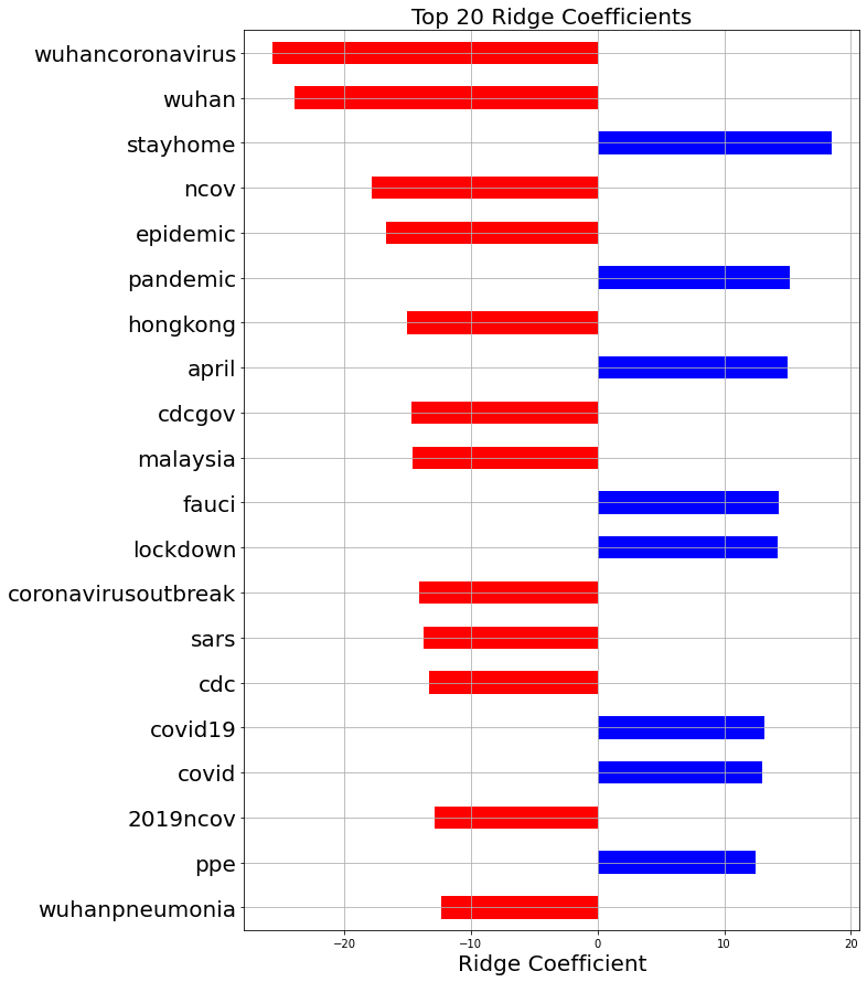
Ridge regression allows us to attempt to use regularization to improve the MSE and MAE. After running cross-validation, the optimal alpha for ridge regression was 8.53. This led to an MAE of 17.84 and an MSE of 495.63, which is worse than linear regression. Ridge regression, however, leads to much more interesting feature weights because it focuses on only the most important features. The figure below shows the feature weights for the top 20 features.

michael4.png

The red bars correspond to words suggesting that a tweet was posted earlier in the outbreak, whereas the blue bars correspond to words used more later on. This graph shows that as time went on, focus shifted away from China and towards the US. It also shows that the word ‘epidemic’ was replaced by ‘pandemic’, likely after the WHO declared COVID-19 a pandemic. Lockdowns and the notion of ‘staying home’ became more popular as the outbreak became a real threat in the United States. Also, PPE, or personal protective equipment, became much more discussed as time went on. This is likely because government authorities were advising people to wear masks, and because hospitals around the country were suffering from a lack of PPE to keep healthcare workers safe.

Word Counts for Important Words

michael5.png
michael6.png
michael7.png
updated_italy_graph.png

Recursive Neural Networks

While the other models were understandable and could show important trends over time, the results were not very promising. With a recursive neural network, the model sees a sequence of words rather than representing each document as simply a bag of words. This allows for long-term interactions and more complex learning, which will improve the model’s ability to predict the date of a tweet.

To process the clean text data, we first converted each tweet to a sequence of integers corresponding to the words, keeping only the top 10000 words in the vocabulary. Limiting the vocabulary size proved vital, as the total number of unique words was too large for Google Colab to handle. Many of these words, such as specific tweet handles, were only used one time, and so were not indicative of a general pattern. A vast majority of the tweets comprised of less than 60 tokens, so we truncated each tweet after 60 tokens and padded sequences with less than 60 tokens.

The model architecture is shown below. The first layer is an embedding layer, followed by a simple RNN layer. The final dense layers converge to a single value that is the prediction.

michael9.png

The figure below shows the training and validation MSE over the epochs. At 10 epochs, the model starts overfitting to the training data, so we stop training at that point. The MSE after 10 epochs was 306.3, which is significantly better than linear regression. The MAE for this model was 12.1, again significantly lower than linear regression.

michael10.png

While this model predicts the date of tweets much better than linear models, there is not much to learn from this. The hidden layer values could prove interesting as word embeddings, similar to Word2Vec. Overall, this data set is massive and has tons of data that could have very interesting information within it. If you want to check out the data and play around with it yourself, here’s the link. Note: downloading tweets takes a very long time, so I would highly recommend reducing the data set.