The fact that this is on my website doesn’t remotely reflect who did the work here - it reflects the fact that I send a $188 check every year over to Squarespace for a domain name and to avoid fighting with CSS. This is a group project I did with Kaila Prochaska and Michael Sullivan for our Data Science Lab class. It’s essentially three mini-projects tied together by themes of COVID-19 and explainability - I’m the primary author for Part 1, Kaila is the primary author for Part 2, and Michael is the primary author for Part 3.
1 | Map-based Animations and Visualizations
While a ton of decent visualizations exist out there (I’m partial to Bloomberg’s), I was never fully satisfied with any one in particular. Perhaps it wasn’t animated or interactive, which limited the user experience, or it didn’t properly account for the full picture - while displaying absolute counts for the number of cases is a natural starting point, I believe that they ought to go hand-in-hand with percentages. The US (at the time of writing) has over 1.3 million reported cases, but also about 320 million citizens. Meanwhile, Spain, with only 47 million citizens, has reported over 220,000 cases. The percentage of the population affected is higher, yet an absolute count would mask that fact.
I thus decided to make my own visualizations, using Excel’s excel-lent 3D Maps feature. I got data from the Johns Hopkins COVID-19 repository on GitHub, which aggregated together an impressive list of governmental sources from France to Taiwan; even more granular data is available for the US. There are some excellent time series available - one, at a global scale, tracks the number of confirmed cases, confirmed deaths, and confirmed recoveries in each country by the day. Another tracks confirmed cases and deaths for each US county by the day. Below are some of the visualizations I built, along with some notes.
First off is a global view of COVID-19. This animation loops three times through the data: the red map shows confirmed cases, the black map shows confirmed deaths, and the green map shows confirmed recoveries. Note how China starts more richly colored on all of the maps - this is because the time period covered by the data starts in late January. This map only shows absolute counts for each of the three metrics, which is why the US and China usually tend to have darker colors.
Next up, we zoom into the United States and view data aggregated by state. Again, we have the same issue: we’re just looking at absolute counts, instead of proportions. As a result, you’ll see New York dominate the map with confirmed cases and confirmed deaths (there was no recovery data for the US). While other states that were also hit hard (e.g. California and Washington) are slightly darker than the rest of the map, it’s harder to tell with New York in the picture.
Now, we move onto relative proportions. Here, we plot what I call the Observed Incidence Rate for each state: the confirmed number of cases divided by the state population. This is an underestimate of the true infection rate, as the dataset (to my knowledge) only included cases that tested positive (and tests are hard to come by!). Asymptomatic carriers are unlikely to be included. Nevertheless, if we look at the scale, even the darkest color represents about a 1.3% observed incidence rate.
The black map shows what I call the Observed Mortality Rate: the number of confirmed COVID-19 deaths divided by the number of confirmed cases. Here, the scale goes all the way to 1/3, but the fact that that data point shows up early on means that it’s more due to a small sample size (very few confirmed cases) than actual deadliness. Again, since we know that the number of confirmed cases is an underestimate, the true value of mortality is likely to be lower than observed.
Finally, we have all of the same visualizations, done at a county level. Here, the data is much more granular - but it’s still interesting to see all of the counties light up in red (or black) all at once. The first two maps show absolute counts, while the latter two show observed infection and mortality rates.
While the maps aren’t quite perfect (I modeled Hawaii and Alaska, but couldn’t figure out how to cut them into the screen without making the 48 look worse), I’m reasonably happy with this first attempt at things.
2 | Explainable models to predict virus spread
In this section, our goal was to use reasonably-intuitive mathematical models to analyze and forecast the spread of the virus under different conditions. We were interested in not only being able to predict the number of cases and deaths in a given population, but also to answer hypothetical questions - what might happen if government action were pushed forward / delayed by a few days? How does social distancing impact the number of infected?
All data came from the COVID Analytics Data: MIT Operations Center. You can download the data from their GitHub here.
2A | the sir model
The Basics of SIR
The SIR model is one of the simplest models of a disease. This model splits the population into three groups: S, susceptible individuals; I, infected individuals; and R, recovered individuals. The whole population is N, and everybody starts out in the susceptible group. As an initial condition, there are a few infected individuals at the beginning of the simulation; we used 100 as our starting point. People transition from susceptible to infected to recovered. The movement of people between categories is described by a system of differential equations, as shown below:

Here, b is the number of susceptible people an infected person has contact with daily (assuming 100% success of transmission), and k is the fraction of the infected group that will recover on any given day (1/infection length).
Assumptions
This model makes a number of assumptions to remain simple. First, it ignores births, immigration, and other factors to keep N constant. It also assumes that once a person has been infected, they are immune - something that hasn’t yet been shown for COVID-19. Values for b and k are set based on domain knowledge and experience, though any values we provide are ultimately estimates. Lastly, our modeling assumes that the infectious period for COVID-19 is between 2 and 14 days.
drawbacks
Simplicity is this model’s main advantage and drawback. It doesn’t account for government intervention (e.g. mandatory quarantining or social distancing). It also makes very wide assumptions, like the values of b and k, that have a massive impact on its predictive curves. The value of b (the number of contacts an infected person has) can vary widely depending on social distancing measures and the nature of the environment (rural vs urban). This makes the model a good starting point, but not the best option for nitty-gritty details.
Issues with comparing the model to actual data
The data itself is also not perfect. For one, not everyone in the population can be tested. This results in a textbook case of sampling bias, since symptomatic individuals are more likely to be prioritized for testing, and thus the proportion of confirmed cases per 100 tests is likely to be higher than the true population average. Also, the existence of asymptomatic carriers mean that the actual case count could be much higher than the data suggests. Overall, the biases in the data mean that we can’t just take the ratio of those who tested positive to the total number of tested individuals to make an assumption on the total number infected.
Preprocessing
We considered a starting point for a region to be when it hits 100 confirmed cases. This forms the start of the SIR model, where everyone in the region is susceptible except for 100 people who are infected.
Visualization
In the video below, we plot predictions for the New York populations for varying values of k. As you can see, as k increases, the number of infected individuals increases, and the orange curve shifts to the left. This demonstrates the fact that a longer infectious period for a virus yields more infected individuals.
In the video below, we plot predictions for the New York populations for varying values of b. As you can see, as b increases, the number of infected individual increases, and the orange curve again shifts to the left. As an infected person has contact with more people, the disease spreads more rapidly.
2B | the DELPHI model
The DELPHI (Differential Equations Leads to Predictions of Hospitalizations and Infections) Model extended the SIR Model to create a system with 11 states. These states take into account whether the individual’s condition was officially detected, whether they were hospitalized or quarantined, and whether they made a recovery or perished from illness. The model account for factors like government intervention and rate of hospitalization to create a more insightful model. Additionally, the model uses historical data to more accurately fit certain parameters, rather than setting them based off of estimations alone as was done in the SIR model.
The basic idea
This model is significantly more complicated than the SIR model and breaks down the population into 11 possible states:
S - Susceptible
E - Exposed (incubation period: currently infected, but not contagious)
I - Infected (contagious)
AR - Undetected, Recovered
AD - Undetected, Died
DHR - Detected, Hospitalized, Recovered
DHD - Detected, Hospitalized, Died
DQR - Detected, Quarantined, Recovered
DQD - Detected, Quarantined, Died
R - Recovered (assumed to be immune)
D - Died
The flow diagram below shows how a person goes between each state, from susceptible to exposed to infected to eventually death or recovery.

The movement between categories is modeled by a complex system of differential equations:
Click to expand fullscreen.
Click to expand fullscreen.
An additional 3 states were added to help with calculations:
TH - Total Hospitalized
DD - Total Detected Death
DT - Total Detected Cases
α is the infection rate (in the SIR model, this was b). γ(t) is the gamma function, which measures government response. Both a and b, described below, are fitted using historical data:
a is the median day of action (when the government measures start)
b is the median rate of action (strength of government measures)

Phase I: Initial government response
Phase II: Policies go into full force
Phase III: Inevitable flattening of response -- measures reach saturation
Assumptions
The DELPHI model requires many assumptions to be made. Firstly, we assume that individuals are not contagious during the incubation period. This means that the “exposed” category contains people who have contracted the virus, but are not yet contagious. We also made several quantitative assumptions:
Median time to detection: 2 days
Median time to leave incubation: 5 days
Median time to recovery (not) under hospitalization: (15) 10 days
Percentage of detected infection cases: 20%
Percentage of detected cases hospitalized: 15%
Finally, the model for the government response as a function of time was assumed to be an arctan function due to the nature and shape of the plot.
Issues with this model
Like any model, this model isn’t perfect. One issue is that it makes a number of assumptions that may not hold true in a given region or at all for COVID-19. It also does not take into account environmental factors like the weather of a region or the pollution levels of a region.
visualization
The figure below shows the predicted plots of various categories of individuals affected by the virus in the New York data. The points show the actual number of confirmed cases in the state. Lines extending past the last data point represent predictions into the future (to June 15, 2020).

This particular model used parameters fitted on historical data, which explains the exceptional fit.
The video below shows the DELPHI plot as a is increased. The variable a represents the median day of action of the government to begin COVID-19 regulations. As you can see, as a increases, the curves grow, demonstrating an increased number of individuals affected by the virus (exposed, infected, recovered, dead).
3 | sentiment analysis and date Prediction for Tweets
Problem
Social media is increasingly the way people around the world get news, share thoughts, and discuss global problems. Using tweets about COVID-19, we analyzed the word choices and sentiment and created various models to predict the date of a tweet given its words. This allows us to see how the discussions surrounding COVID-19 have shifted, and in turn how the world’s reaction to the pandemic has changed.
Data
The data consists of 230 million tweets from January 28th, 2020 to May 1st, 2020 that contained keywords related to the novel coronavirus. These keywords include Coronavirus, China, Wuhan, pandemic, and Social Distancing, among others. The tweet IDs were collected using Twitter’s search API and made public on GitHub.
Because 230 million tweets is an extremely large dataset, we only collected up to 1000 tweets per hour per day, and ended with a total of 2.3 million tweets. To convert tweet IDs to actual tweet data, we used a script in the GitHub repository that automatically retrieved tweets from the Twitter API. The returned JSON had hundreds of fields, but we kept only a select few for modeling: the actual text of the tweet, the date, the favorite count, the retweet count, a boolean for if a tweet was a retweet, and the language of the tweet. We dropped all tweets with NA values and all tweets not in English, which led to a total dataset size of 1.32 million tweets. Then, the text was tokenized and we removed all non-alphanumeric tokens.
Sentiment Analysis
Click to expand fullscreen.
We used a rule-based sentiment analyzer from NLTK called VADER to calculate the overall sentiment score for each tweet. Sentiment is measured from -1 to 1, where -1 is considered the most negative while 1 is the most positive. We then calculated the average sentiment of all tweets for each day. The figure to the right shows the average sentiment over time. Average sentiment increased as the pandemic went on, contrary to what we expected. This could be because people adjusted to a new normal and became more positive about the future. More research could shed more light on these surprising findings.
DATE PREDICTION
Our goal is to create a model that predicts the date of a tweet with just the tweet text, favorite count, retweet count, and compound sentiment score. The tweet text was converted to a unigram word counts with scikit-learn’s CountVectorizer, keeping just the top 10,000 words. Words that were used to search for tweets were removed from the dataset, but only if they were added as keywords midway through the data collection — this includes words like ‘distancing’, which was added in March due to the rise of the phrase ‘social distancing’. The data was then split into a training and test set with the test set comprising of 20% of the data. We tried predicting the date of each tweet using a linear regression, ridge regression, and an RNN to predict the date of each tweet, and used mean absolute error and mean squared error to evaluate each model.
Linear Regression
A simple linear regression was the first baseline for modeling the problem. This model has an MAE of 16.95 and an MSE of 460.39. To verify that the assumptions of linear regression were met, we made a residual plot and a histogram of the residuals. As the figures below show, the variance and mean of the residuals were mostly independent of the actual date of the tweet. The figure also shows a histogram of the residuals that resembles a Gaussian.
Click to expand fullscreen.
Click to expand fullscreen.
Regularization Methods
Ridge regression allows us to attempt to use regularization to improve the MSE and MAE. After running cross-validation, the optimal alpha for ridge regression was 8.53. This led to an MAE of 17.84 and an MSE of 495.63, which is worse than linear regression. Ridge regression, however, leads to much more interesting feature weights because it focuses on only the most important features. The figure below shows the feature weights for the top 20 features.
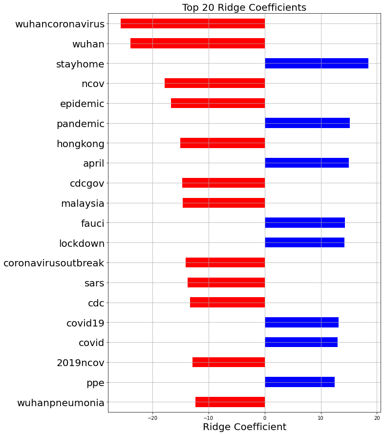
The red bars correspond to words suggesting that a tweet was posted earlier in the outbreak, whereas the blue bars correspond to words used more later on. This graph shows that as time went on, focus shifted away from China and towards the US. It also shows that the word ‘epidemic’ was replaced by ‘pandemic’, likely after the WHO declared COVID-19 a pandemic. Lockdowns and the notion of ‘staying home’ became more popular as the outbreak became a real threat in the United States. Also, PPE, or personal protective equipment, became much more discussed as time went on. This is likely because government authorities were advising people to wear masks, and because hospitals around the country were suffering from a lack of PPE to keep healthcare workers safe.
Word Counts for Important Words


Recursive Neural Networks
While the other models were understandable and could show important trends over time, the results were not very promising. With a recursive neural network, the model sees a sequence of words rather than representing each document as simply a bag of words. This allows for long-term interactions and more complex learning, which will improve the model’s ability to predict the date of a tweet.
To process the clean text data, we first converted each tweet to a sequence of integers corresponding to the words, keeping only the top 10000 words in the vocabulary. Limiting the vocabulary size proved vital, as the total number of unique words was too large for Google Colab to handle. Many of these words, such as specific tweet handles, were only used one time, and so were not indicative of a general pattern. A vast majority of the tweets comprised of less than 60 tokens, so we truncated each tweet after 60 tokens and padded sequences with less than 60 tokens.
The model architecture is shown below. The first layer is an embedding layer, followed by a simple RNN layer. The final dense layers converge to a single value that is the prediction.

The figure below shows the training and validation MSE over the epochs. At 10 epochs, the model starts overfitting to the training data, so we stop training at that point. The MSE after 10 epochs was 306.3, which is significantly better than linear regression. The MAE for this model was 12.1, again significantly lower than linear regression.

While this model predicts the date of tweets much better than linear models, there is not much to learn from this. The hidden layer values could prove interesting as word embeddings, similar to Word2Vec. Overall, this data set is massive and has tons of data that could have very interesting information within it. If you want to check out the data and play around with it yourself, here’s the link. Note: downloading tweets takes a very long time, so I would highly recommend reducing the data set.